Sidebar growth + engagement
The Edge sidebar provides quick access to apps and allows multitasking without opening new tabs. The goal is to increase activation by better showing users the value of sidebar.
As the designer working on sidebar, I collaborated closely with a PM and developers to create a first, run growth experience for consumers and a shared links feature for enterprise users.
Click through rate
↑ 2x (0.8% to 1.2%)
Qualitative feedback
↑ Positive sentiments
Role
Lead designer
Responsibilities
UX/UI, strategy, prototyping, research
Status
🚀 Shipped
Timeline
2025
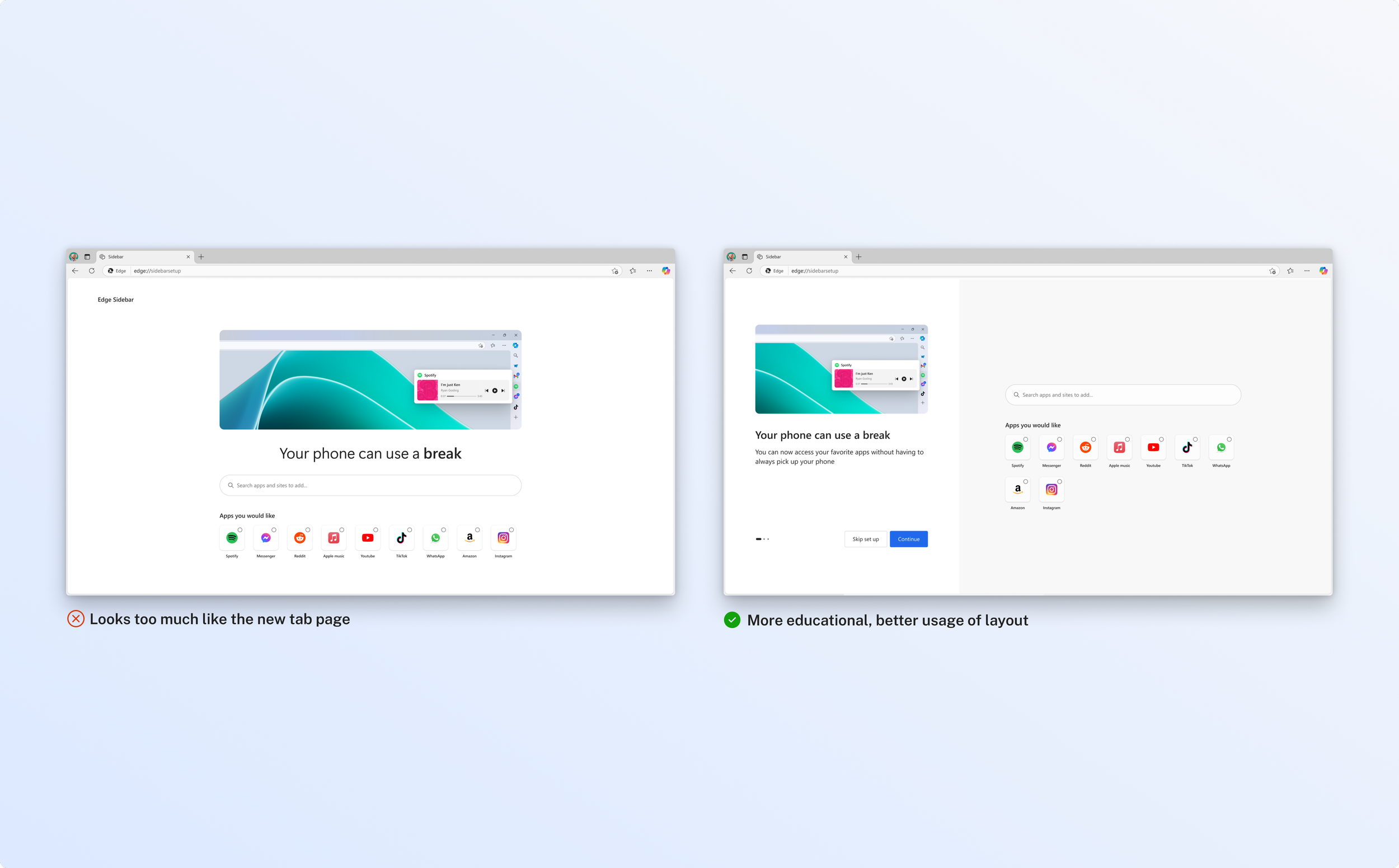
The main problems
Too many default apps
Edge on default comes with a suite of apps and users do not engage with them.
Lack an understanding
Users are uneducated on sidebar benefits due to the lack of effective education and contextual guidance.
The opportunities
Too many default apps → Provide personalization
Design hypothesis: Users are more likely to return to something that feels tailored to their needs rather than generic default options.
Lack an understanding → Contextual guidance
Design hypothesis: We can drive growth by offering help exactly when and where users need it, building users trust with the product.
Explorations for user reactivation
I explored various contextual opportunities to engage existing users in unobtrusive ways, while still effectively capturing their attention so that they can give sidebar a second chance.

Solution: Customize app
Final decision was to house this notification within the “customize” app so that it remains accessible post first, run experience without disrupting the users’ primary workflow.
A potential trade off is that this may only capture existing users, because new users are unlikely to engage with an area of the browser they aren’t aware of.

How might we expand and upsell this feature to the broader Edge user base?
I explored full page options to see how can we include these features as part of the Edge browser updates page and capture users beyond the sidebar framework.
Sidebar, shared links
Shared links is an enterprise sidebar app that highlights links that are frequently shared by users in Outlook and Teams, making it easy to find sites and files without scrolling through old messages.
Goal: Drive engagement by keeping users within our ecosystem through a seamless, integrated link discovery experience.
Problem
Users frequently rely on Outlook and Teams to share links, but finding a specific one later requires scrolling through old emails and chats, which makes the experience tedious and inefficient.
Opportunity
Provide a centralized hub: Quick access to shared resources helps users stay focused, act faster and improves user productivity.
I explored various iterations to find the best way to display the information hierarchy.

Blue: Option 1 offers a simple search experience, while Option 2 introduces a more complex filter-based approach. However, most users tend to rely solely on the search box and rarely use advanced filters.
Orange: I explored a larger card size for option 1, but in reality most items will not have a preview, so I quickly pivoted to option 2 to a horizontal card design, eliminating the item preview from scope.
Shipped outcome
The outcome focuses on simplified search and filtering, along with a cleaner hierarchy in the horizontal card designs by replacing individual avatars with a generic shared icon. This helps put the focus on the content itself, reducing visual clutter and improving scan-ability.

Reflections
A key theme with the sidebar is that aggressive engagement such as frequent flyouts or notifications may drive short-term interaction but hurt long-term loyalty. Many users find these interruptions frustrating and end up closing Edge entirely, often not returning.
By taking a more thoughtful and less intrusive approach, we have an opportunity to build trust and create a sidebar experience that users genuinely want to engage with.
In the press