
From 0-1: Designing a Web3 payroll suite
The concept of Franklin is straightforward: increase Web3 adoption by integrating crypto into paychecks. As the solo designer for this start up, I took the project from concept to launch. This involved defining user flows based on research, leading user testing, and delivering high-fidelity prototypes for the beta product.
Impact: The soft launched design helped Franklin secure more investors and close a $2.9 million seed round.
Role
Product Designer
Contributions
End-to-end designs, research, user testing
Timeline
2022 (5 months)
Status
🚀 Shipped
Web3 companies lack out-of-the-box financial tools. The market needs crypto-native solutions for simple business processes such as payroll, accounts receivable, payable and taxes.
Payroll IA
This flow shows how payroll works inside the product. Since the system supports multiple types of payments (fiat, crypto, stream, and one-time), I mapped out the full journey to catch gaps and make sure each path was consistent.
Admin IA
This flow shows how an admin sets up their account, connects a wallet, and verifies company and worker details before inviting employees and contractors. Mapping this out helped ensure a smooth onboarding process and caught potential gaps early.
The initial approach was to put everything up that we need to on the screen (must haves vs. nice to haves) and while it was overwhelming, I found it easier to remove content than to add it back. We did rounds of testing to see how users interacted with the preliminary information presented to them.
Iterations
❌ Users would like ways to filter
❌ Collapsable Navigation
❌ Modal is not the best usage here
✅ Better layout and visuals
✅ Tree Navigation, more visuals
✅ Improvement on previous iterations
Here is an example of user testing of V1 of the product (we have come a long way since this design). For the initial rounds of user testing, it was important for us to get feedback as early as possible. We utilized Maze for to conduct usability testing for the admin onboarding session.
Ideally, it would be better to speak with users and monitor the testing sessions, but due to timeline constraints, Maze was the logical choice in order to get timely feedback.
Final designs leveraged Tailwind components for quicker implementation.
User testing
Is it accessible?

Additional explorations with different color schemes: one of the main challenges for UI is working with the existing color palette. The vibrant tones were hard to incorporate while passing accessibility.
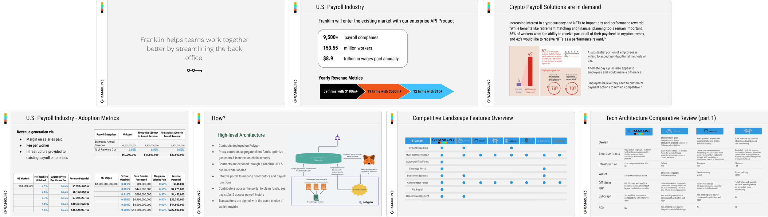
I wore many hats: some examples include pitch decks, marketing assets, business cards.
Reflections
Working on Franklin as their sole designer taught me to move fast while balancing clarity and complexity. Beyond designing end-to-end flows and prototypes, I learned how to influence the founder’s decisions, advocate for user needs, and communicate design rationale effectively. This experience strengthened my people and collaboration skills, showing me how design can drive not just usability, but product strategy and team alignment.
My contributions ends here, but here are next steps for the team:
Investor Readiness: Package learnings, highlight design-led progress + metrics
Plan for Scale: Add compliance, multi-payment options, and scalability to your roadmap
In the press